May 2020 -
Black & White
Page 2 of 4
The picture needs to have strong contrast and well defined shapes to work well in black and white. We found that there was a quite different perception of the same picture depending whether it was in colour or black and white.
Hover over or touch a thumbnail to see the picture. On to page 3 page 4
FC
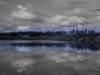

Frances chose this picture of Bavelaw Marsh to which she had added a band of blue in the centre


Anne chose Frances' picture taken in the woods. She liked the tunnel shape and the way that the eye was drawn to the back of the picture. The picture was strong enough to work well in black and white.
GL IH


Both Gillian and Alister chose the same picture from Gillian's collection. Gillian had left a touch of colour in the black and white shot. Alister liked this and thought it a nicely balanced picture.


Agreement again between Ingrid and Ann. This beautiful picture of an unusual clematis bloom fills the frame.
JC

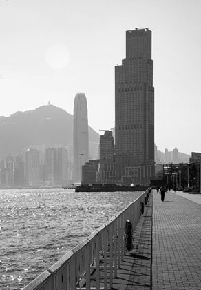
Joe chose his picture taken in Hong Kong as his favourite


Sandra chose his picture which was shot on B&W film in October last year, negatives scanned. The picture was cropped, contrast changed etc. to produce the final image. Sandra liked this and thought the picture had good tones.
LD


Les chose his converted colour shot of the flower Doronicum, which he thought worked well with its strong colours and simple subject.


Ingrid chose his picture of his cat in sepia. She thought the cat came right into the room.
MC


Marjorie chose her picture of a Lane in Tallin, taken with a sepia filter.

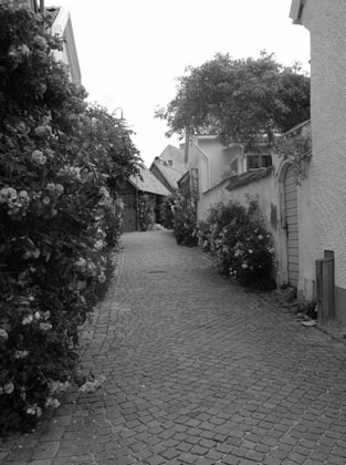
Gillian chose a Lane in Visby, interestingly taken with a red filter. She thought it a good composition and it made you wonder what was round the corner.